
 English
 Español


Logo Usage
Lockup is the preferred logo for most applications — use it on printed materials, website headers, email signatures, and event signage wherever space allows. The lockup includes our full name and should never be cropped or rearranged.
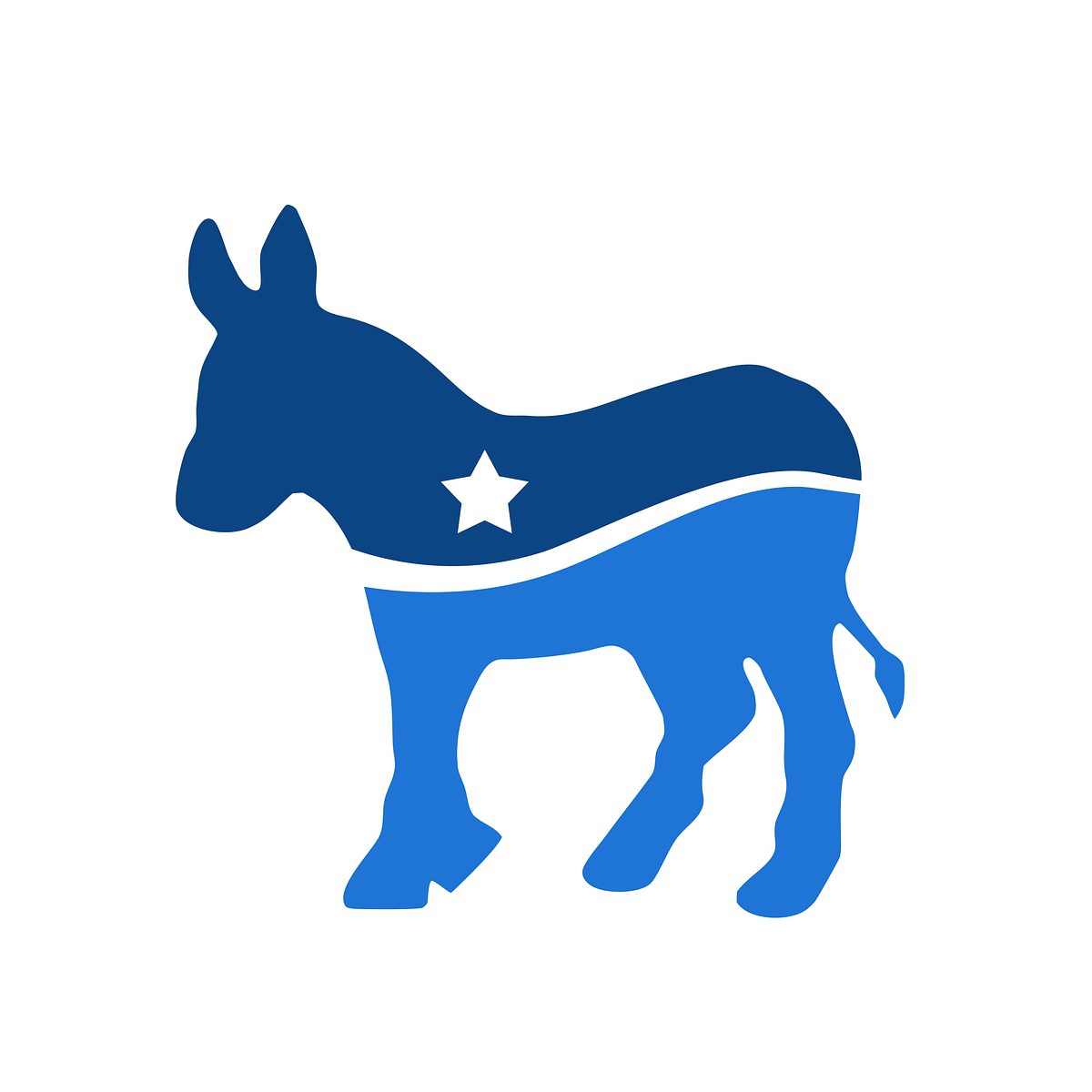
Icon is for compact spaces where the full lockup won’t fit — social media profile pictures, favicons, pins, and small-format promotional items. Always pair it with our written name nearby when context requires identification.
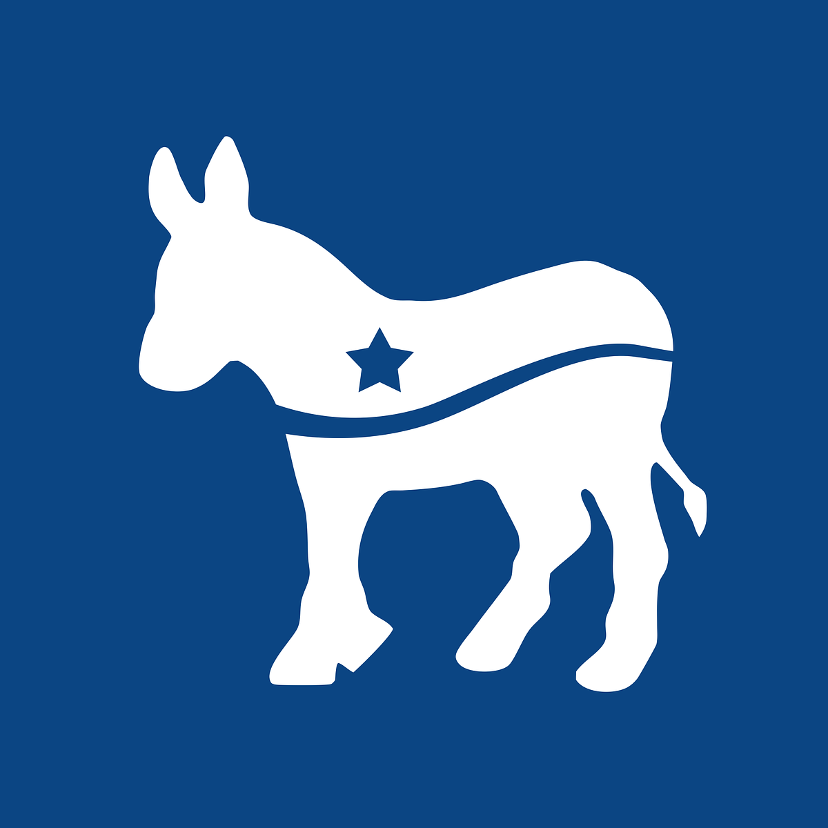
Use the color versions on white or light backgrounds. Switch to the white versions when placing the logo on dark backgrounds, photographs, or colored surfaces. Never place the color logo on a busy or low-contrast background.
Clear space: Maintain a minimum clear zone equal to the height of the icon mark on all sides of the logo. Do not crowd the logo with other text, images, or graphic elements.
Don’ts: Do not stretch, rotate, recolor, add effects to, or recreate the logo. Always use the provided files.
Color Guidelines
Primary Blue is the foundation of our visual identity. Use it for headlines, buttons, links, and key calls to action. It conveys trust, stability, and Democratic tradition.
Secondary Navy provides depth and contrast. Use it for dark backgrounds, footer areas, overlays on photography, and secondary text where a softer alternative to pure black is needed.
Accent Orange is an accent for emphasis — use sparingly for alerts, highlights, donation buttons, or to draw attention to urgent calls to action. It should never compete with Primary Blue for dominance on a page.
Neutral tones handle body text, borders, backgrounds, and other supporting elements. Prefer lighter neutrals (50–200) for backgrounds and darker neutrals (700–900) for body text. Avoid pure black (#000) — use Neutral 900 instead.
When in doubt, lead with Primary Blue and keep the overall palette restrained. A page should feel calm and trustworthy, not busy.
Typography
Our brand uses the fonts configured in the site design settings. Use the display font for all headings, page titles, and prominent text. Use the body font for paragraphs, lists, and general content.
Maintain clear hierarchy: one heading level per section, consistent sizing, and generous line spacing for readability. Avoid using all caps except for short labels or badges.
General Guidance
- Consistency matters. Every piece of communication — digital or print — should feel like it comes from the same organization.
- Accessibility first. Ensure sufficient color contrast between text and backgrounds. Use alt text on all images. Choose legible font sizes.
- Less is more. White space is a feature, not wasted space. Let the content breathe.
- When in doubt, ask. Contact the committee before creating materials that deviate from these guidelines.